When you’re exploring gradient embroidery, you’ll discover that mastering color blending is key to creating captivating designs. Begin by familiarizing yourself with the color wheel. Then select a range of thread colors that transition smoothly from one to another. The digitizing process requires precise planning, particularly in terms of stitch density and spacing. This ensures a seamless flow from one hue to the next. Now we’ll explore how to elevate your gradient embroidery skills further.
Key Takeaways
- Select multiple thread colors with gradual shifts in intensity for seamless transitions.
- To create a seamless blend of colors, it is essential to employ different stitch densities and directions.
- Digitize medium color underlays to create a solid base for gradient effects.
- To ensure flawless transitions, refrain from using neon and metallic threads.
- Focus on broader design elements and allow enough space for color changes.
How to Do Gradient Embroidery

Let’s explore how to do the gradient embroidery. Here’s a detailed way to achieve a seamless transition between colors.
Know the fundamentals of color blending.
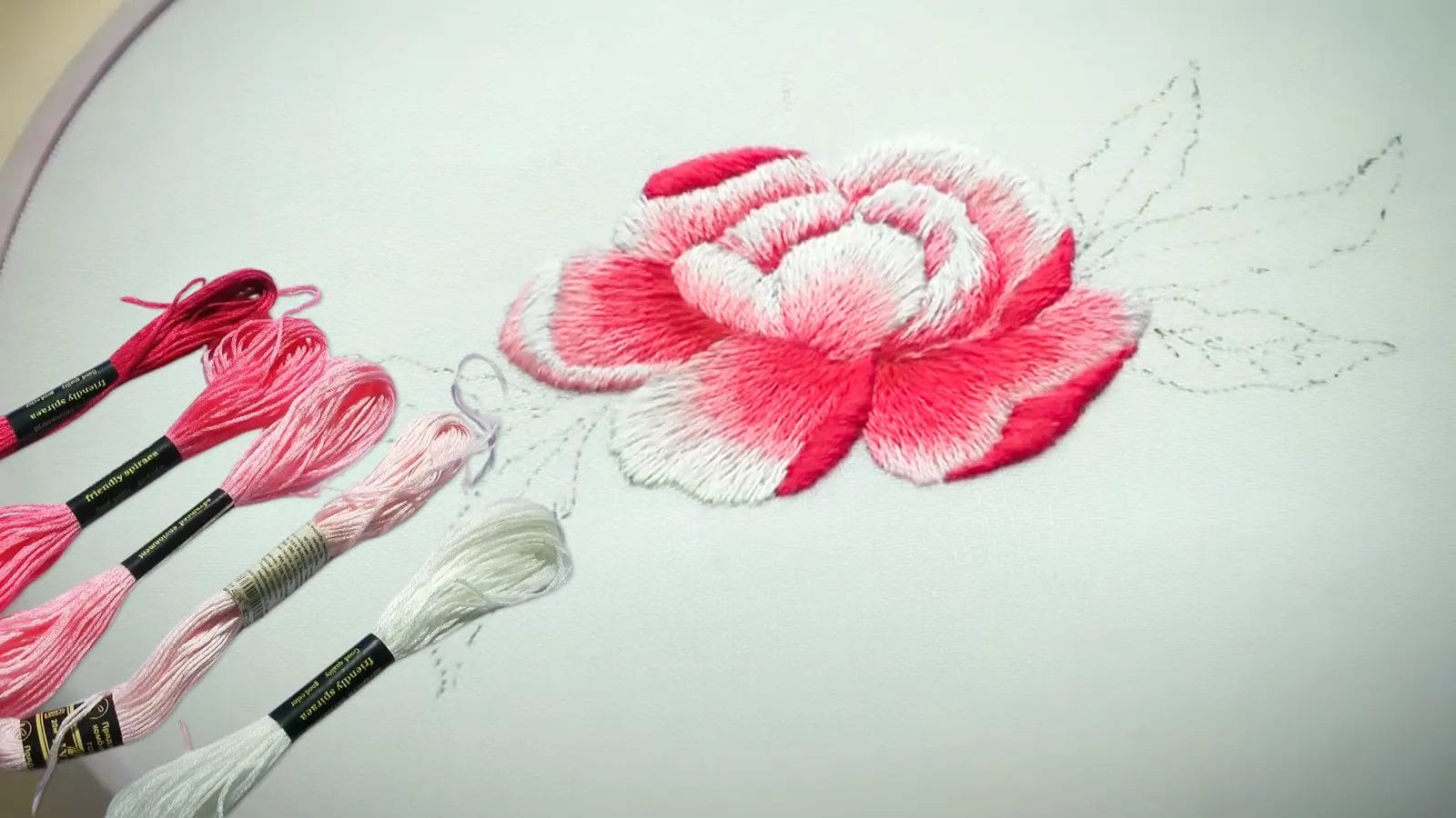
Understanding the fundamentals of color blending is essential for mastering gradient embroidery. It requires a precise application of hues and smooth transitions between shades. To achieve a flawless gradient, start with a thorough understanding of the color wheel. Knowing how primary colors (Red, Yellow, Blue) mix to form secondary and tertiary colors significantly expands your palette.
When blending, it is important to choose threads that transition gradually in color intensity. Properly adjust your stitching technique to maintain a seamless transition between threads. Pay close attention to the tension of the thread and the density of the stitches. They’re crucial factors that affect the smooth blending of colors. Mastery of these elements ensures your embroidery designs exhibit depth and realism.
Use different colors of threads to achieve a gradient effect.
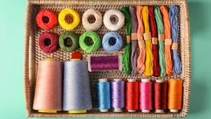
There’s a variety of thread colors. Mastering color blending sets the stage for using different thread colors. Start by selecting multiple thread colors that transition seamlessly from light to dark.
Gradual changes in thread colors are essential for effective gradient embroidery. To create depth and dimension, experiment with various shades and tones. Proper placement and blending of thread colors using specific techniques are crucial for achieving a smooth transition.
Start the digitizing process and build the fillings.
Now it’s time to start the digitizing process for gradient embroidery. Begin by choosing your desired colors, and then carefully strategize the stitch density. Then digitize medium color underlays as a base for your gradient effect.
Next, build the fills by creating varying density fills with different color ratios. It allows for a smooth transition between shades. Carefully align your stitch lines to seamlessly blend the colors.
Tips for Gradient Embroidery Design
When designing gradient embroidery, you can’t use neon and metallic colors. Ensure there is ample space to change thread colors, facilitating a seamless blend.
Refrain from using neon and metallic colors.
To achieve a seamless gradient in your embroidery, avoid using neon and metallic colors. They can disrupt the smooth transition between shades. Neon and metallic threads often clash with the subtle blending required in the art of gradient embroidery. Metallic threads have a tendency to reflect light in a chaotic manner. The vibrancy of neon colors has the potential to overshadow the desired gradient effect. These colors fail to provide the seamless transition between colors that standard threads do.
Give enough space to change the color of the thread.
Ensure there’s ample space between color changes in your gradient embroidery. Proper spacing is crucial for achieving a professional gradient effect.
By leaving sufficient gaps between color shifts, you allow the different thread colors to blend smoothly. Adequate space also preserves the integrity of your design. This attention to detail will elevate your gradient embroidery work.
Don’t get caught up in small details.
It’s equally vital not to get bogged down in small details when embroidering the design. Overcomplicating your design can lead to inconsistent stitching. Instead, choose stitch types like satin or tatami that naturally facilitate color blending.
Don’t apply gradient embroidery to photo images.
Avoid applying gradient embroidery to photo images due to the inherent limitation of thread color blending. Photo images often contain intricate details and subtle shading that embroidery threads can’t accurately replicate. The thread limitations make it challenging to achieve the smooth color transitions and fine details that photos require.
Instead, focus on graphic elements with clear, defined shapes and distinct color sections. By doing so, you can take full advantage of gradient embroidery’s strengths.
Conclusion
To master gradient embroidery, start by selecting a harmonious range of thread colors. Emphasize smooth transitions by applying colors with precision. Avoid neon and metallic threads, which can disrupt the gradient effect.
Concentrate on broader design elements and use proper blending techniques. By paying attention to these details, you’ll achieve captivating gradient embroidery pieces.


